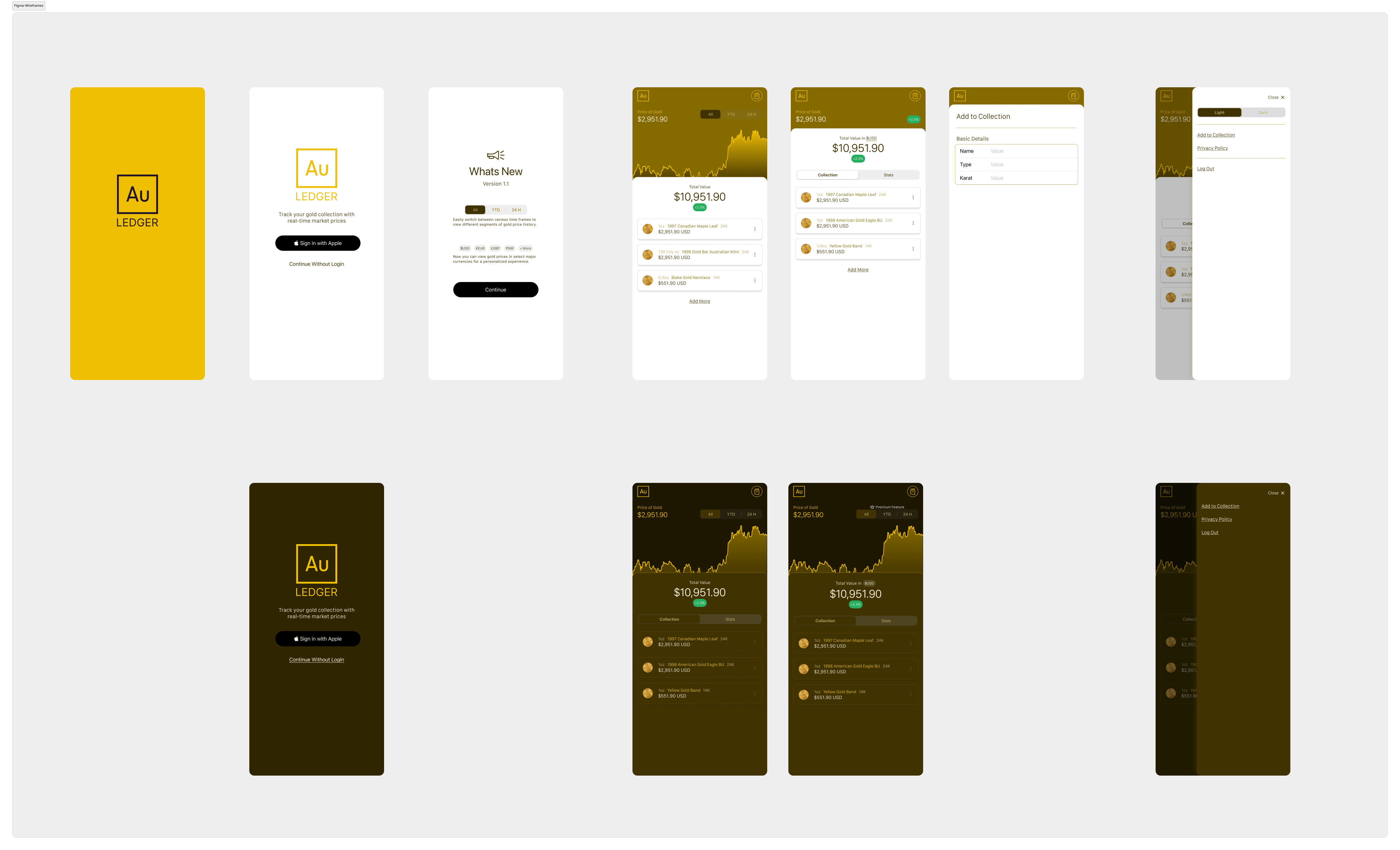
I designed
and shipped
AuLedger.
A gold portfolio tracker I built from scratch. From Figma to a live App Store release.
No team. No backend. Just a focused product that solves a real problem. Every product, design, and tradeoff decision was mine.
Gold owners still do too much mental math.
Focused, fast, and private.
I didn't want this to feel like a finance app. No accounts. No syncing. No clutter. Just open it and see what your gold is worth.
Lean. Build-first. Real.
AI helped. I decided.
I used AI to move faster through the build. It didn't choose what to make, what to cut, or how things should work. Those calls were mine.
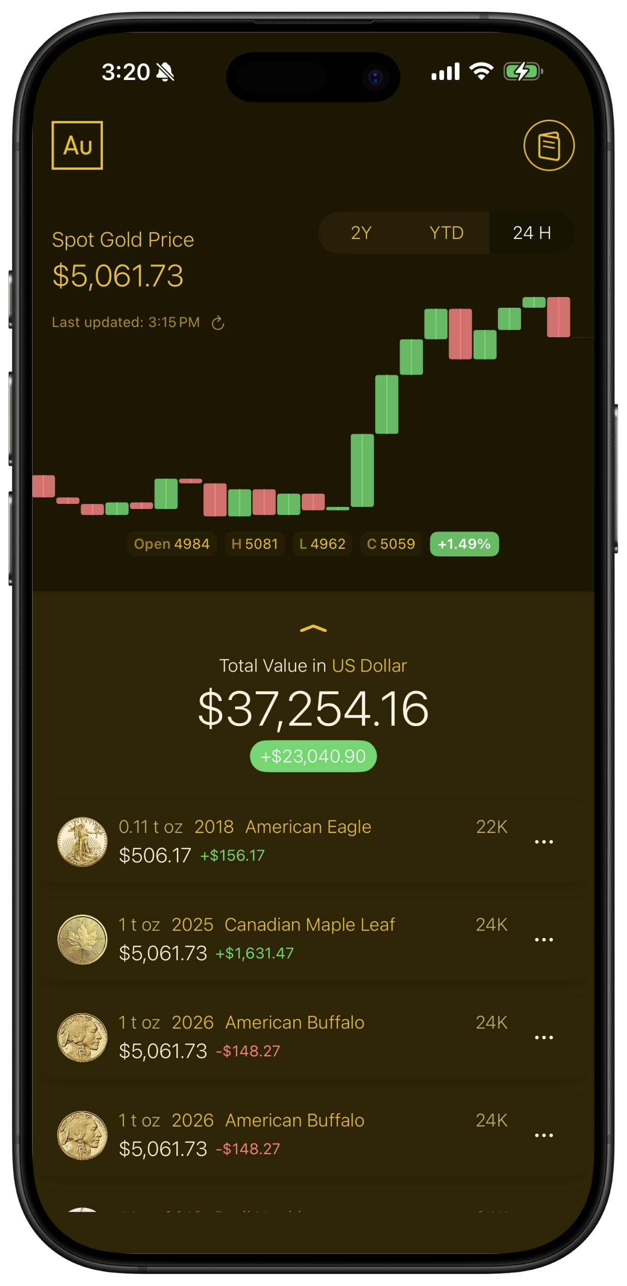
The app.
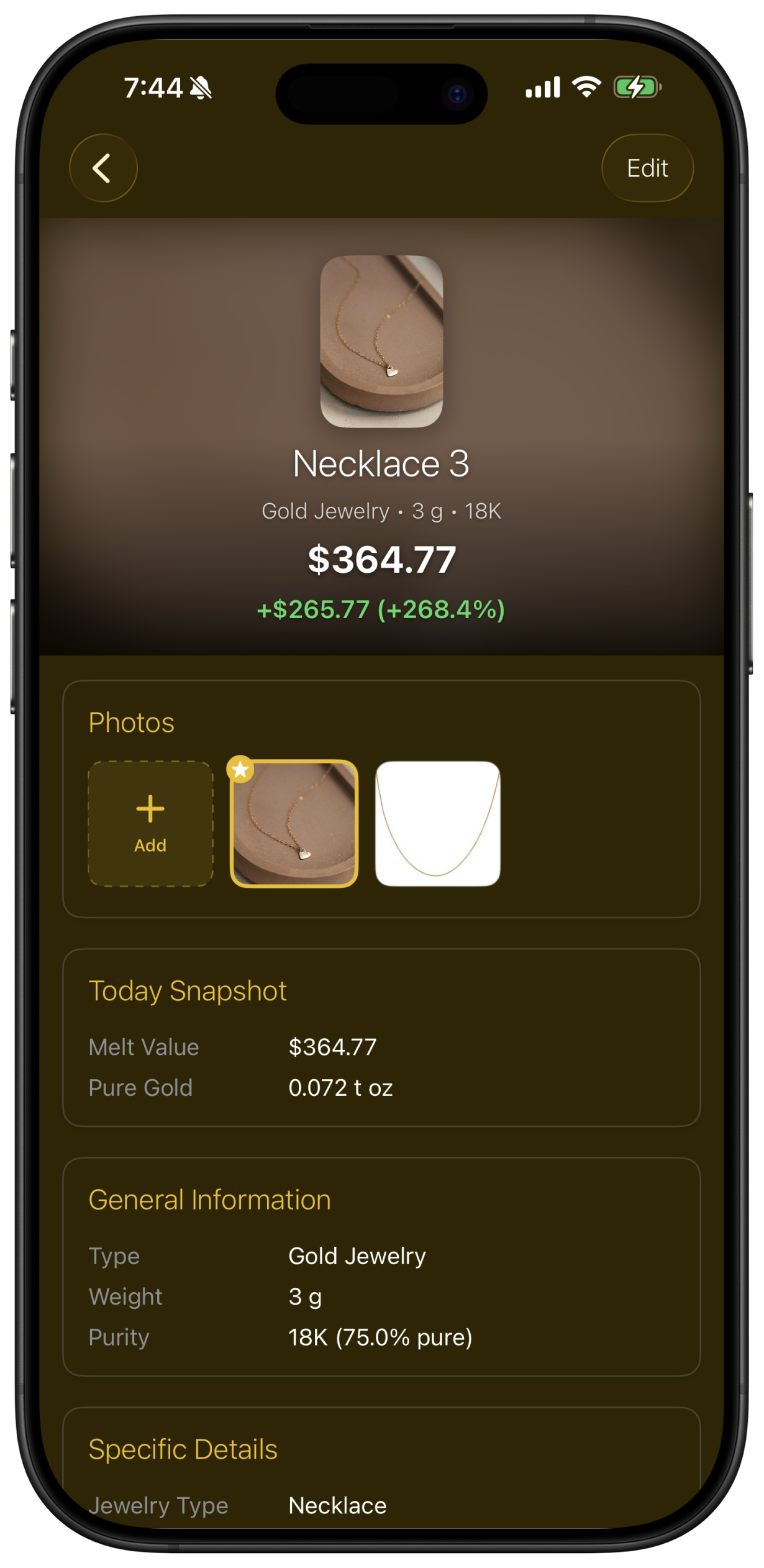
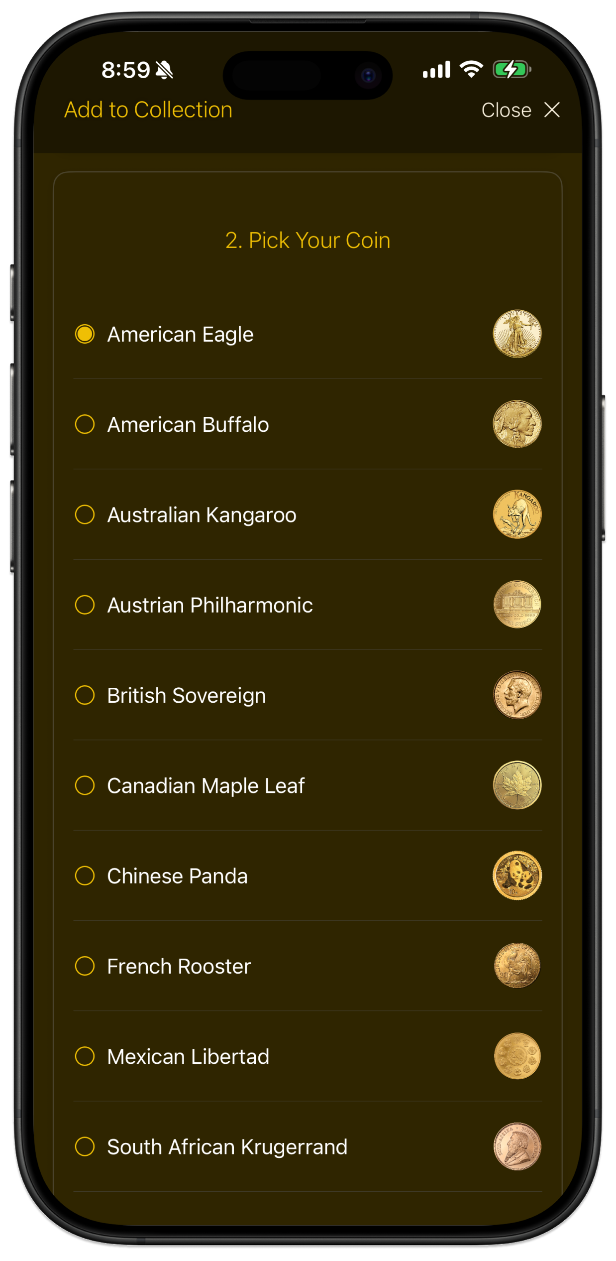
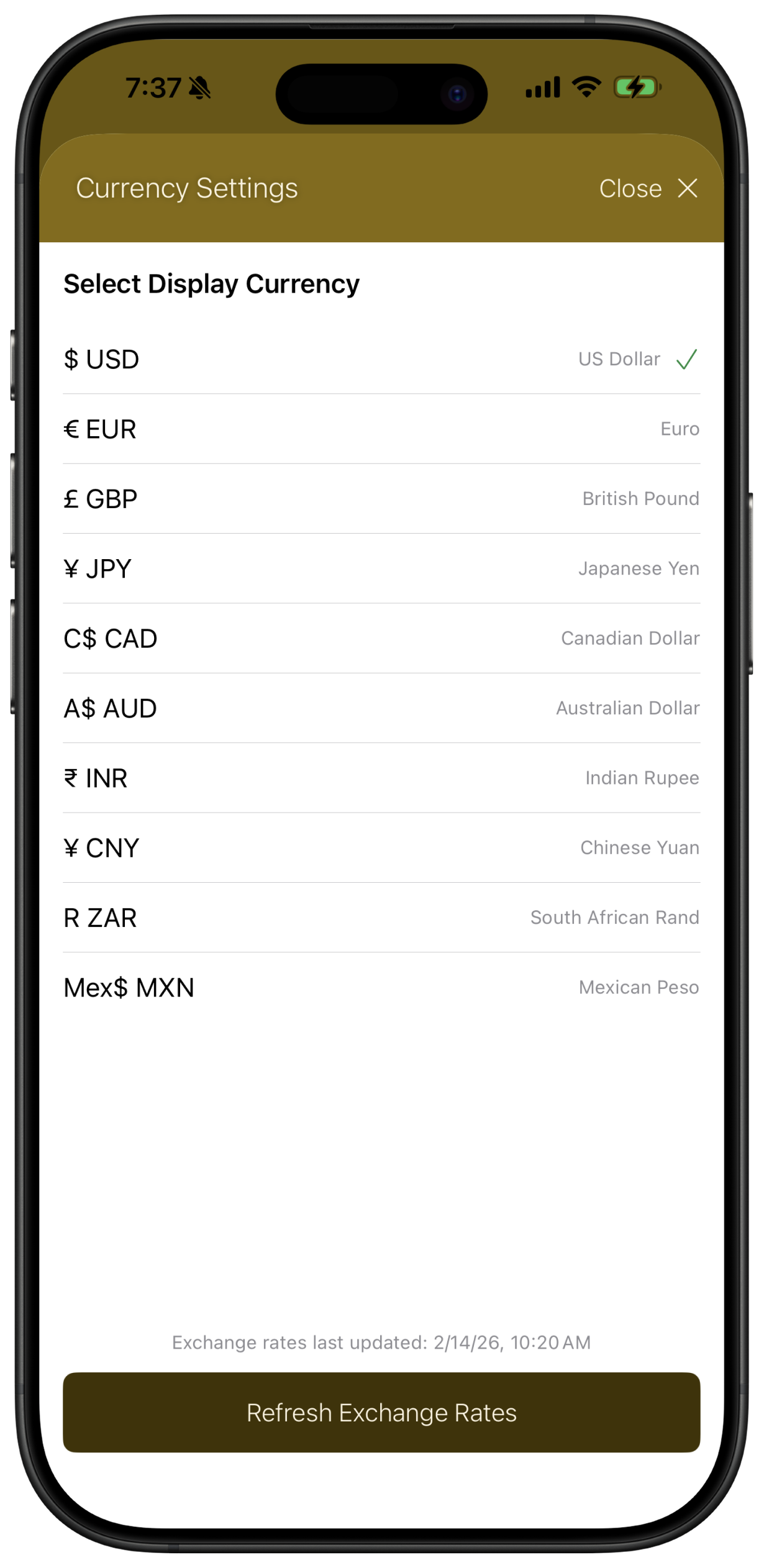
Four screens. Portfolio, item detail, coin picker, and currency settings. Each one answers a specific question.
Why it looks like this.
I didn't design this to be clever. I designed it to be obvious. Each callout is a real decision, with the tradeoff that came with it.
I show exactly when the price last refreshed because gold moves constantly. If the data is 20 minutes old, you should know that. Hiding it would make the screen look cleaner. It would also make it harder to trust.
I tried more options. It just made the chart harder to use. Collectors mostly care about long-term appreciation and what happened today. 2Y, YTD, and 24H covers both. Everything in between is noise for this use case.
Most people open the app to check one thing: what is my gold worth right now? That number is the biggest thing on screen. The chart gives it context. The list breaks it down. The total is the answer.
That +$23k figure is computed on every load from the current spot price, not pulled from a database. Storing it would mean it's only accurate as of the last sync. Calculating it live means it's always correct.
Most visits are just a quick check, not a deep dive. The list is compact by design: name, value, gain. If you want more, tap. The UI treats passive reading as the default case, because that's what it actually is.
The decisions that shaped it.
Why no account system?
Because trust matters more than growth hacks. I didn't want people signing up just to track what they already own. Local-first removes that friction entirely.
Why gold-specific?
A generic portfolio app doesn't understand melt value or purity. I built something narrow on purpose. Being specific is what makes it useful.
Why not add more features?
I didn't want to add everything upfront and make the app harder to use. I focused on getting the core right first. More features will come, but only if they actually make the product better, not just bigger.
Why this monetization?
The free version is genuinely useful. Premium adds convenience, not access. I never wanted to lock people out of the thing that makes the app worth using.
What it's built on.
SwiftUI, local-first data storage, and a live gold pricing API. Everything runs on the device.
This is real.
Live on the App Store. Used by real people to track real collections. Values pull from live gold prices, so the numbers are always current. No mockups. No fake data.
Getting it in front of users.
I didn't just build the app — I needed to get it in front of people.
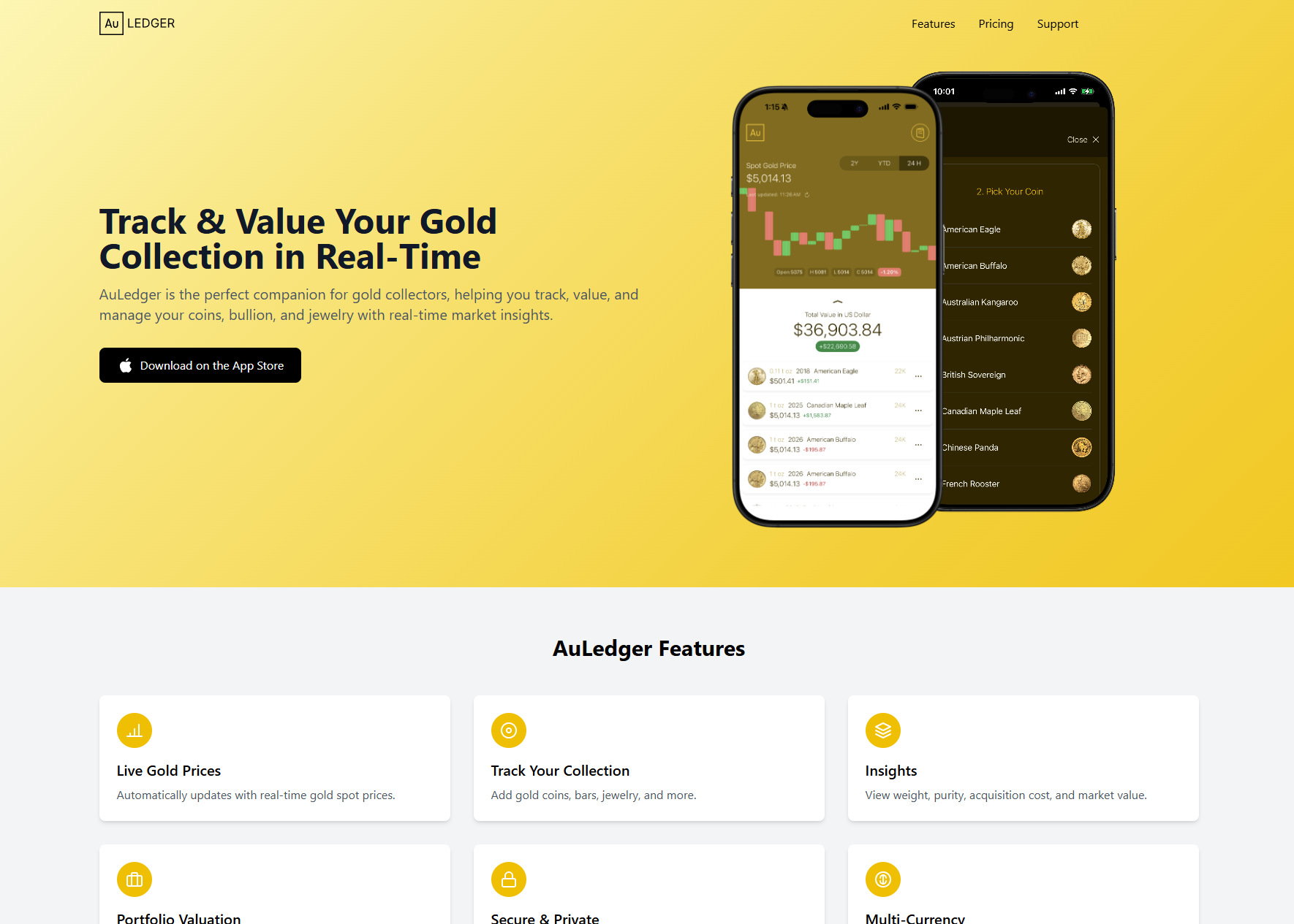
Clear message. One goal.
I created a simple landing page focused on one thing: what the app does and why it matters. No fluff, no feature lists. Just the value prop and a direct path to download.
Clarity over marketing. If someone lands on the page and immediately understands what they get, the job is done.
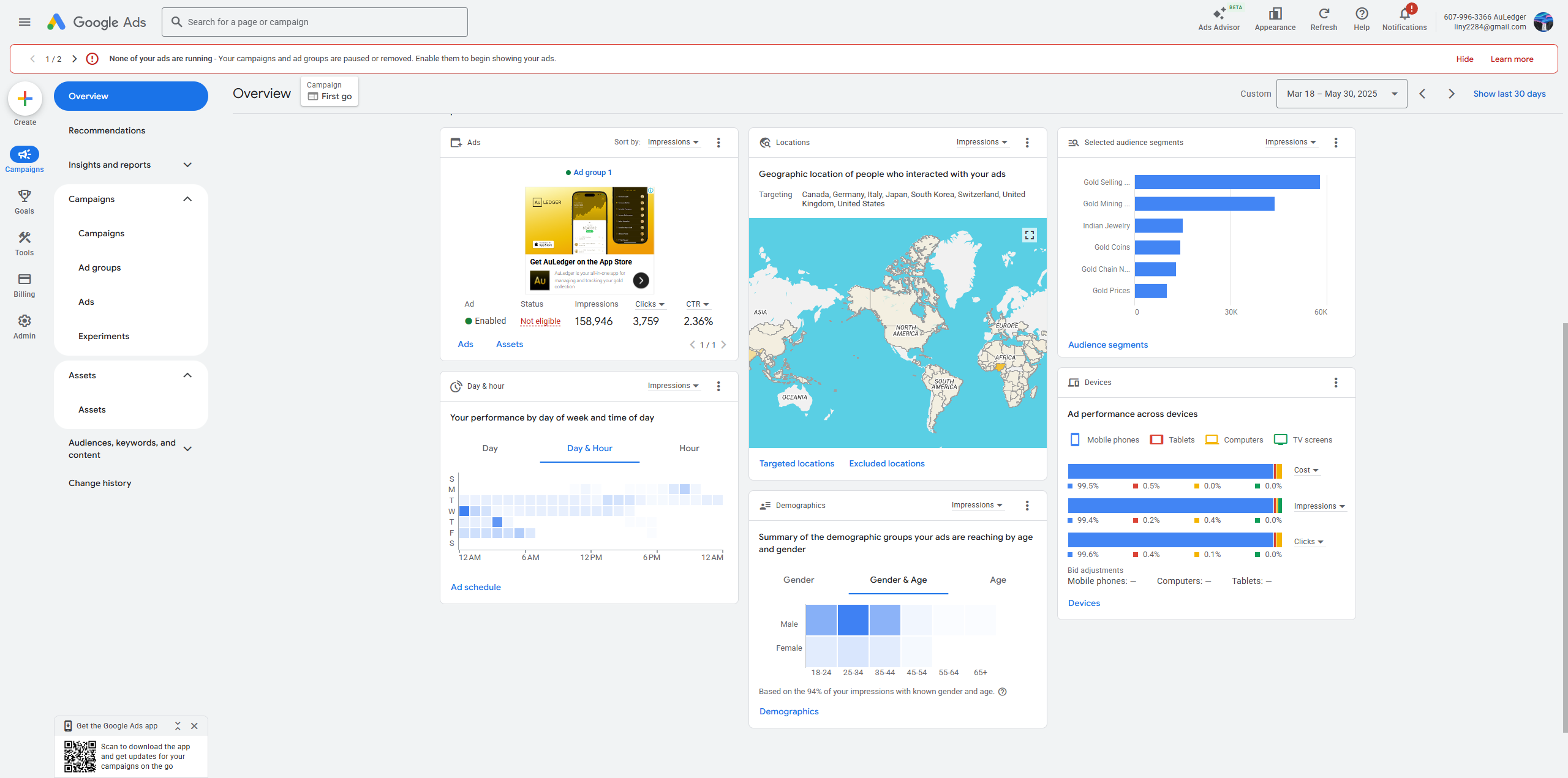
Real clicks. Real signal.
I didn't want to assume people would use this, so I ran ads and let real behavior answer that. Search campaigns targeted people actively looking for gold tracking tools.
Clicks told me demand was real. Behavior on the landing page told me where the message needed tightening. It was cheaper to learn this early than to find out later.
What shipping this taught me.
Every time I added something, I asked whether it made the app clearer or just bigger. Most ideas got cut.
Getting to a real, working product fast meant I could make real decisions, not hypothetical ones.
Building this end-to-end changed how I think about design. Less about screens. More about what actually happens when someone uses it.
I think, design,
and ship.
I don't just design interfaces. I build real products and see them through. If you're looking for someone who can take an idea all the way to something people actually use, let's talk.